
.jpg)
Introduction to Principles & Techniques
Section 1 laid the foundation for understanding what alt text is, why it matters, and who relies on it. Now that you know the “why,” Section 2 focuses on the “how.” This section introduces Scribely’s best practices for writing effective image descriptions, starting with a simple scoping exercise to help you assess each image’s role and context. You’ll then learn a practical, repeatable workflow for drafting alt text that is accurate, concise, and meaningful. Whether you’re describing a product photo, an event graphic, or an abstract illustration, these guidelines will help you write with clarity and purpose.
Ultimate Guide Contents
Section 1: Image Description Essentials
Section 2: Core Principles and Crafting Your Description
Section 3: Image Types and How to Describe Them
Section 4: Alt Text, SEO, and AEO in the Age of AI
Section 5: Advanced Descriptive Techniques
Introduction to Principles & Techniques
Section 1 laid the foundation for understanding what image description is, why it matters, and who depends on it. Section 2 focuses on how to write image descriptions effectively. You’ll learn Scribely’s best practices for crafting clear, concise, and purposeful image descriptions, starting with how to assess an image’s role, audience, and surrounding context. We’ll guide you through a repeatable writing workflow that provides an easy structure for writing alt text. In the “Writing in Context” section, we’ll apply these techniques across a real-world e-commerce example. You’ll follow the customer journey across multiple stages from a homepage banner to a product detail page, and see how alt text evolves at each step to deliver meaningful, accessible experiences.
Context & Purpose: Tailoring Your Approach
Not all images serve the same purpose, and not all descriptions should sound the same. The goal of any image description is to provide an equivalent experience for users who can’t see the image or need to access it through assistive technologies. That means the description should add the same value that the image adds, nothing more, nothing less. Just as images are chosen to support, clarify, or emphasize surrounding content, image descriptions should be written with that specific context in mind.
Effective image description depends on more than just describing what is in an image; it requires understanding the context in which the image appears. Various factors shape how an image should be described to ensure clarity, relevance, and accessibility. There are many different types of context to keep in mind when writing image descriptions. The following context types help guide image description writing decisions, from the image’s function on the page to the platform it appears on.
Image Type
The purpose and role of an image guides how it should be described. Functional images like buttons or icons need clear, action-based alt text (“Search,” “Download report”). Informative images such as charts or maps require summaries of key insights, while artistic or editorial images may need descriptions of mood, style, or symbolism. An image’s form and function determine what users need from its description. See Section 3: Image Types and How to Describe Them for more.
Surrounding Content
Alt text should complement, not repeat, nearby page text or captions. If the surrounding content already explains what the image shows, alt text can be shorter or even omitted. On the other hand, if the image adds information not found elsewhere on the page, the alt text should capture that missing detail. Consider what the user already knows based on where the image is placed and the intended purpose of their experience on that page.
Audience
Your audience shapes the tone, detail level, and terminology of your descriptions. A diagram in a medical journal may use clinical language, while a consumer-facing site should keep things simple and clear. Cultural context also matters: certain symbols, colors, or gestures may hold different meanings in different communities. Language accessibility adds another layer because alt text may be translated or read by users whose first language is not English.
Reading Order
Screen readers follow the page’s code order, not its visual layout. This affects how and when alt text is read aloud. If an image comes before or after related text, users may hear the description out of context. Use alt text to anchor the image’s meaning without relying on visual placement. Good HTML structure and ARIA landmarks can help screen reader users follow the intended flow.
Brand Identity
Alt text should reflect the organization’s tone and voice, as well as any specific terminology used to describe products and services. A playful brand might use light, informal language, while a financial institution may favor precision and formality. Descriptions that align with overall messaging feel more natural and reinforce the brand experience. That said, clarity and accessibility should always come first.
User Intent
The goal of the page influences what the alt text should prioritize. A product image on an e-commerce site might highlight features and aesthetics, while the same image on a press release might focus on branding or launch details. Consider what the user is trying to achieve on the page (i.e., buy something, learn something, compare options) and shape the description accordingly.
Platform Constraints
Alt text behaves differently across platforms. Social media platforms often limit character count, which requires even more focused writing. Email clients, mobile apps, content management systems, and PDF readers may or may not support advanced markup like extended descriptions. Always account for the technical context where the image will appear across systems and workflows.
Content Strategy
Alt text should be part of a broader content strategy. If your site consistently uses infographics or image-based data, plan for extended descriptions and consider where to host them. If your platform heavily features user-generated images, like a blog or gallery, offer guidance, tools, and reminders to help contributors write accessible descriptions.
Scribely’s Writing Best Practices
Before you start writing, take a moment to understand the image you are about to describe. Start by reacting to the visual, noting your first impressions and what stands out. Then consider your intent: what should users think or feel when they read this description? Check the surrounding content so you do not repeat information already on the page. Finally, identify the image’s purpose (functional, informative, artistic, marketing, product, or decorative) to determine how much detail you need. Once you have scoped the image, follow our four-step writing workflow to turn those insights into clear, concise alt text.
Before You Write
Before drafting alt text, spend a moment to scope the image. Every word counts, so focus on what matters most.
- React
Note your first impressions. What details stand out, surprise you, or seem most significant? - Intent
Consider what you want users to think or feel when they encounter this image. What message should the alt text convey? - Context
Review surrounding text, headlines, captions, or other images. Identify which facts have already been communicated so you don’t repeat them. - Purpose
Decide whether the image is functional, informative, artistic, marketing, product, or decorative. This will guide your level of detail.
Writing Workflow
Use these four steps to turn your notes into a polished description:
- Identify
Begin with a clear label: “Icon,” “Photo,” “Diagram,” “Infographic,” etc. This orients the user immediately. - Focus
Describe the primary subject or action. Answer the question: What is the one thing the user must know? - Details
Add only those visual elements that serve the image’s purpose. Transcribe any text that appears in the image. - Edit
Read your draft aloud or through a screen reader. Trim unnecessary words, confirm clarity, and ensure the description fits within about 250 characters (or link to a longer description if needed).
Practical Tips: Do’s and Don’ts
Use this checklist as your go-to reference for writing alt text that’s both clear and effective. The do’s reinforce habits that make descriptions strong, efficient, and user-focused; the don’ts warn against common pitfalls that can undermine clarity or accessibility. Keep this list handy as you write or review alt text, and consult it whenever you’re unsure whether a phrase adds value or gets in the way of understanding.
Do’s
- Be succinct and clear
Keep alt text at 1 to 2 sentences (250 characters); every word should add value. - Use punctuation strategically
A comma creates a pause; a period signals a full stop when read by a screen reader. - Use active verbs and complete sentences
Verbs like “shows,” “illustrates,” or “compares” make descriptions more direct. - Transcribe on-image text
If text is integral to understanding the image, include it exactly as it appears. - Describe identity when relevant
Note a person’s race, gender, age, or disability only if it is essential to the image’s meaning.
Don’ts
- Don’t start with “Image of,” “Photo of,” or “Picture of”
Your initial label already signals that this is an image. - Don’t begin with “A” or “An”
Omit articles to keep descriptions tight (e.g., “Person walking…” not “A person walking…”). - Don’t repeat information
Avoid restating captions, headings, or body text that users can already access. - Don’t force keywords for SEO
Prioritize clarity and user needs over search terms. - Don’t add interpretation or opinion
Stick to observable facts; let users draw their own conclusions.
Writing in Context: A Progressive Walkthrough
Alt text is never one-size-fits-all. The way you describe an image should change based on where it appears and what the user is trying to do at that moment. In this section, we’ll walk through a typical e-commerce customer journey and demonstrate how image descriptions evolve across different contexts, from a home page banner, to a product listing, and finally to a product detail page. At each step, we’ll scope the image, apply Scribely’s writing workflow, and compare our alt text to the existing alt text (if available). This side-by-side approach highlights how writing with context in mind creates a more useful and inclusive experience for all users.
1. Home Page
User Story: A user is scrolling through the Target website home page and sees a promotional banner featuring Owala bottles showcasing the latest colors and styles.
Context: Header reads, “Summer 2025, New & Trending.” The caption reads, "New Owala colors just dropped. Check out the latest FreeSip & FreeSip Twist bottles, only at Target.”
Purpose of Image: High-level visual teaser designed to spark interest and inspire clicks.

Existing Alt Text: None - image marked as decorative.
Why it doesn’t work: This image is not decorative because it has a purpose; it provides customers with a sense of what the new Owala colors are, and invites them to explore the new designs. This information is not provided in the surrounding context of the page.
Scribely Writing Process:
- Identify: Promotional advertisement.
- Focus: Owala FreeSip and FreeSip & Twist water bottles
- Details: Bright purple and fuchsia water bottles with white, black, steel blue, teal green, and hot pink accents.
Scribely Alt Text: Promotional advertisement [ID] of two Owala water bottles, showcasing new styles and colors [Focus]. The FreeSip bottle is bright purple with white, hot pink, and medium pink accents [Details]. The FreeSip & Twist bottle is fuchsia with black, steel blue, and teal green accents [Details].
Why it works: The alt text offers a clear, concise visual summary of the new colors and latest designs featured in the marketing content below the image. It encourages users to explore the products without overwhelming them with excessive detail.
2. Landing Page: Owala Bottles
User Story: After clicking the promotional banner on the Target homepage, the user is taken to a landing page featuring three different options for Owala bottle designs.
Context: Category links to Tumblers, Water Bottles, and Travel Mugs.
Purpose of Image: To help customers decide which option best fits their style and needs.

Existing Alt Text: None - all three images marked as decorative.
Why it doesn’t work: These images are not decorative because they have a purpose; they help customers decide whether they are looking for a Tumbler, Water Bottle, or Travel Mug. They help customers follow the right path to the type of bottle that works best for them.
Scribely Writing Process:
- Identify: Side-by-side Owala Tumblers.
- Focus: Two distinct design options.
- Details: The FreeSip Tumbler Stainless Steel Water Bottle has a tapered bottle, push button lid with a drinking spout and side handle. The Stainless Steel Straw Tumbler has a narrow, cylindrical base, flat lid, and a straw.
Scribely Alt Text: Side-by-side Owala tumblers [ID] showcasing two distinct designs [Focus]: the FreeSip Tumbler with a tapered stainless steel body, push-button lid, drinking spout, and side handle [Details]; and the Stainless Steel Straw Tumbler with a slim cylindrical base, flat lid, and integrated straw [Details].
Why it works: In this case, the alt text emphasizes functions and features rather than color combinations, helping customers quickly identify which Owala bottle best fits their needs. This targeted approach streamlines their decision-making and guides the customer toward the right product.
3. Product Listing Page
User Story: The customer peruses the product listing page for Tumblers, comparing the various options in that category.
Context: Product names, other product images.
Purpose of Image: Present the distinguishing features of each tumbler.
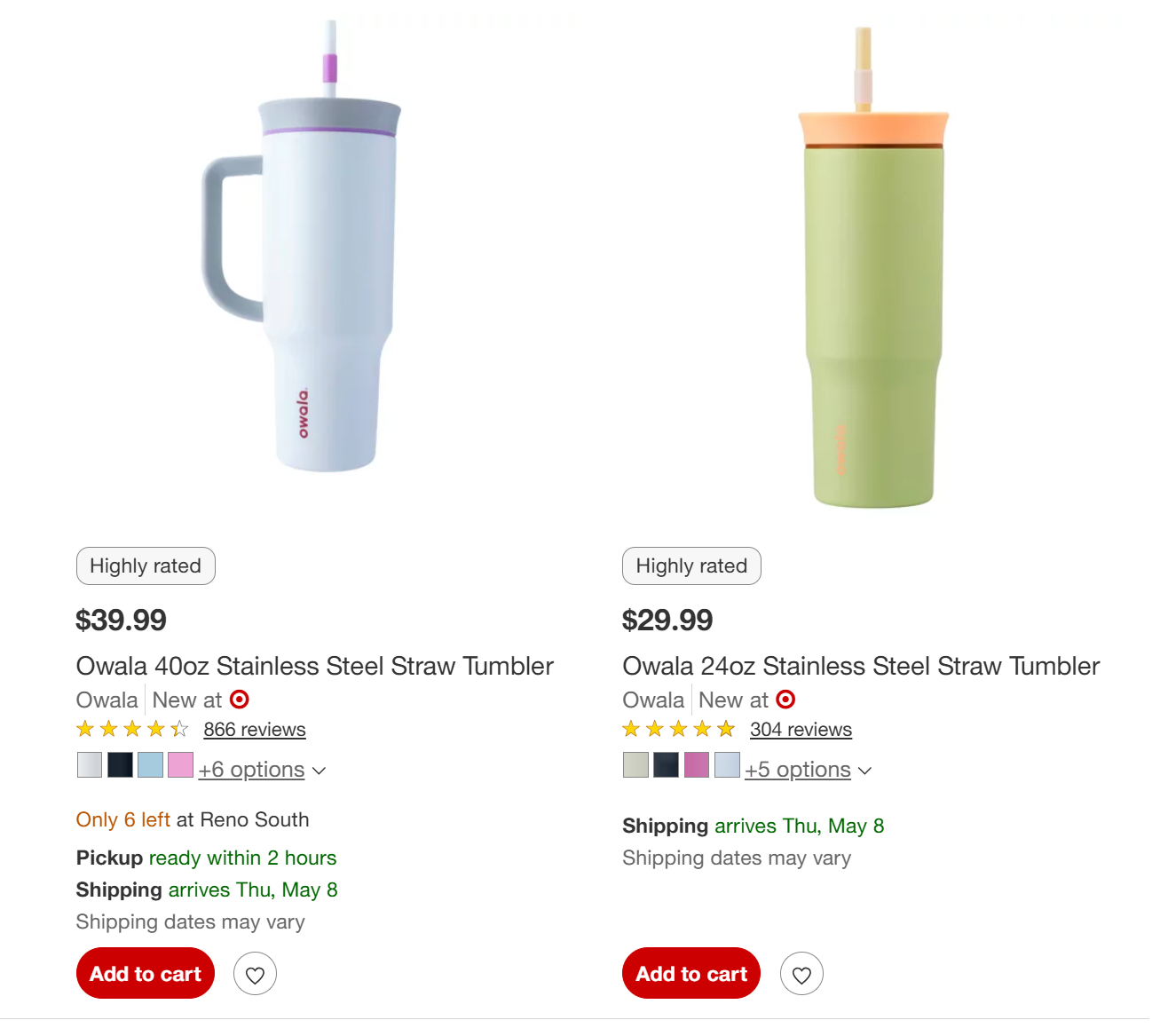
Existing Alt Text [Left Product]: “Owala 40oz Stainless Steel Straw Tumbler”
Existing Alt Text [Right Product]: “Owala 24oz Stainless Steel Straw Tumbler”
Why it doesn’t work: These descriptions are non-descriptive and repetitive. Screen reader users already have access to read the product names. The images play an important role in helping customers distinguish between the product listings on this page. This saves customers time and helps them decide which product they want to purchase. Any difficulty at this stage may result in the customer deciding to abandon the search altogether.
Scribely Alt Text [Left Product]:
- Identify: Owala 40oz Stainless Steel Straw Tumbler
- Focus: Bottle design and features
- Details: Narrow, cylindrical base, side handle, flat lid, and a straw. Sky blue bottle with gray, white, and fuchsia accents.
- Alt Text: Owala 40oz Stainless Steel Straw Tumbler featuring a narrow, cylindrical base, flat lid with a built-in straw, and a sturdy side handle. The tumbler is sky blue with gray, white, and fuchsia accents.
Scribely Alt Text [Right Product]:
- Identify: Owala 24oz Stainless Steel Straw Tumbler
- Focus: Bottle design and features
- Details: Soft tapered cylindrical base, flat lid, and a straw. Avocado green bottle with light yellow and pale pink accents.
- Alt Text: Owala 24oz Stainless Steel Straw Tumbler with a soft tapered cylindrical base, flat lid, and built-in straw. The bottle is avocado green with light yellow and pale pink accents.
Why it works: In this context, the surrounding product names provide basic identification, but the alt text adds meaningful visual detail that supports informed decision-making for assistive technology users. While both products include straws, the alt text highlights design differences, such as the presence of a handle on one tumbler, which may be a key factor in the customer's choice. This layered information helps customers more efficiently filter and compare options and advance through the customer journey.
4. Product Details Page
User Story: After clicking on the tumbler with the handle, the user lands on the product page looking for more detail. They want to understand how the lid, straw, and handle work, since the written description doesn't provide enough specifics. The product images help fill in those gaps by showing the design from different angles. When the user selects a color, the images update to show specific color combinations, and the alt text changes to describe the design and colors clearly. This helps the user decide if the bottle fits their needs.
Context [Product Description]: “Fewer refills equal more hydration—all thanks to the Owala 40oz Tumbler. But this is no ordinary insulated cup. Not only does it hold a whole lot of water, but it also has an awesome 2-in-1 lid. Want to sip? Use the sturdy, reusable straw. If swigging is more your thing, just remove the straw and sip through the spout. Another handy feature? It has an adjustable handle to suit left-handed and right-handed water lovers alike.The Owala 40oz Tumbler fits easily into most cup holders, making it the perfect car companion—plus, it’ll never ask, “Are we there yet?””
Context [Highlights]:
- “40-ounce insulated stainless steel tumbler with straw.
- 2-in-1, Splash-Resistant lid with Removable straw, lets you sip or swig
- Double-wall insulation keeps drinks colder longer
- Wide opening for cleaning and adding ice
- Dishwasher-safe lid and hand-washable cup
- BPA, lead, and phthalate-free water bottle.”


Existing Alt Text [Product Sequence]:
- Owala 40oz Stainless Steel Straw Tumbler, 1 of 14
- Owala 40oz Stainless Steel Straw Tumbler, 2 of 14
- Owala 40oz Stainless Steel Straw Tumbler, 3 of 14
- Owala 40oz Stainless Steel Straw Tumbler, 4 of 14
Why it doesn’t work: These descriptions are non-descriptive and repetitive; screen reader users already have access to read the product names. The addition of image numbers in total does not add helpful information. Also, the product description and key highlights do not provide a visual description so the product images are the only way to access that information.
Alt Text [Image 1]: Side view of the Owala 40oz Stainless Steel Straw Tumbler in Tangy Tango, featuring a vibrant orange matte body. The tumbler includes a flat bubblegum pink lid with a matching built-in straw, a rectangular side handle, and the Owala logo near the base. The straw is accented with a bright orange straw seal.
Alt Text [Image 2]: Side view of the Owala 40oz Stainless Steel Straw Tumbler in Tangy Tango, with the lid pulled up to reveal bubblegum pink external grooves and a dark pink gasket. The shiny stainless steel interior shows internal grooves for a secure seal.
Alt Text [Image 3]: Close-up of the closed bubblegum pink lid featuring a rim around the edges. The sturdy matching pink straw is secured at the center with a dark pink silicone gasket, which is integrated into a neon green sliding spout that rests flat beneath the lid's rim.
Alt Text [Image 4]: Aerial view of the top of the lid with the straw removed. The dark pink straw hole is sealed, and the neon green sliding lid, featuring an etched Owala logo, is pulled back to reveal the drinking spout.
Why this works: Each description adds unique visual information from different angles, helping users form a complete understanding of the product. Together, the image descriptions mirror the product image series by clearly conveying design features, color combinations, and accent details.
Final Thoughts on Writing in Context
As this example shows, great alt text is not one-size-fits-all. The same image can and should be described differently depending on its role in the user journey. What inspires curiosity on the home page might need to convey specificity on a product page. Writing with context in mind ensures that users who rely on assistive technologies receive the informational value and navigational experience that every customer deserves. It’s not just about access; it’s about giving every user the best possible experience at every stage of their journey.
Section Summary
With these guidelines and workflow steps, you can write alt text that is precise, complete, and tailored to your audience. In Section 3, we will apply these principles across different image types and complexity levels.

Image Description
Image Description Goes Here
Ultimate Guide Section 3: Image Types and How to Describe Them
Tailored approaches for charts, infographics, decorative images, social media visuals, and more.
Ultimate Guide Section 3Key Takeaway
Effective alt text starts with understanding the image’s purpose and context. Scribely’s clear, four-step workflow helps you write accurate, concise descriptions that focus on what matters most, enhancing accessibility without adding unnecessary detail.
Cite this Post
If you found this guide helpful, feel free to share it with your team or link back to this page to help others understand the importance of image descriptions.


